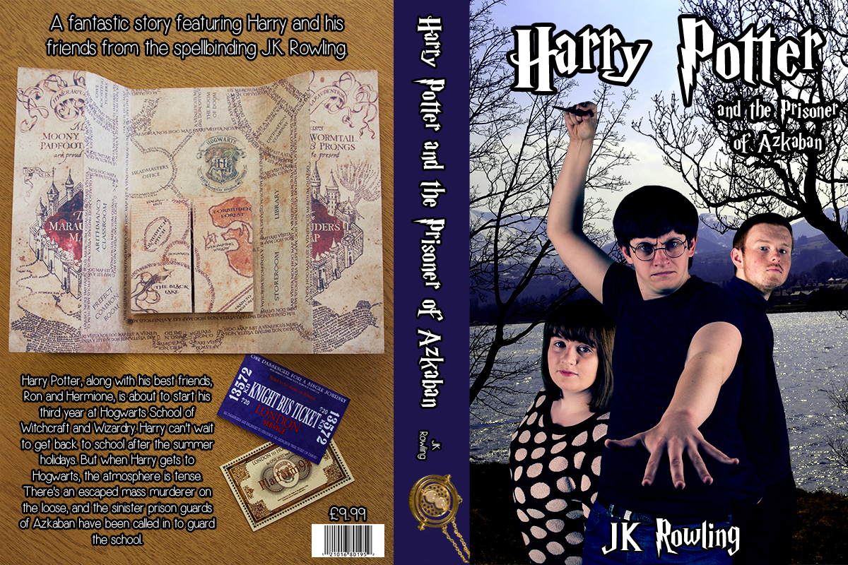
 So here is my final book design! I adjusted the position of the Time Turner so that it would look more in line with spine, but that was the only final change I decided to make overall. I’m so pleased with this, I think its looks so good and I think I’ve done a good job with keeping to the essence of Harry Potter, and tying in the colour scheme used on the original book. I’ve learnt a lot of skills on this project, particularly having patience when it comes to editing. I had a mishap with this when putting it altogether. My Photoshop actually crashed and I lost most of my layout but I easily put it back together once the program had recovered. The green screening has definitely taught me patience when it comes to the editing, but it could be useful in the future if I was to get a similar commission. Overall, a successful project!
Book Jacket
Bookjacket: Putting Together the Final Design
Once all of the photos were taken, it was time to begin putting the final design together. I took a step by step screenshot of adding each layer in CS5 so I could demonstrate the journey of creating the final piece.
1) I created the original document using dimensions I found on Google. I went with pixel dimensions of 1200 x 800, with a resolution of 300. I used the Rulers tool to separate the different parts of the cover, and create the canvas for the spine.

2) Then I chose a background image for my front cover. I decided to go with a photo I took while in Llanberis a couple of years ago. I went with this because of the iconic scene by the lake, I felt this image represented that really well. I played around with the levels feature and the selective colour tool so I could try and create a dark image. I think this worked really well.

3) I placed the background image of the map and the tickets onto the back cover, ready to add the blurb onto it later on in the process.

4) Creating the spine was really simple. I used the Eyedropper tool to get the colour from the Knight Bus ticket. I wanted to keep a purple colour scheme on this project, to keep it more authentic to the original book. I layered the shape on top of the background image between the ruler lines.

5) My favourite part was adding the characters to the front cover. This is when I felt like the final piece was starting to come together. I placed them as close together as I could, similar to the movie posters. I merged the layers to make them easier to bulk edit and then I had a play around with levels, colours and brightness and contrast to come up with a darker look.

6) I wanted to work on the spine first and get that finished before working on the rest of the book. I downloaded a font from dafont which was the typography used for the film posters. I kept this to white and added a stroke to the edge just so it would stand out on the purple.

7) Then I added the authors name in a different font, and thought it would be best to add the Time Turner I had edited to the spine. I didn’t want to over clutter the back page and thought this was a good part to place it on.

8) I found a blurb online from the back of the original book. There were two separate parts. I placed a line at the top of the page which read: ‘A fantastic story featuring Harry and his friends from the spellbinding J.K. Rowling’. I wanted to add this but I couldn’t fit it in the place I had in mind for the blurb, so across the top was the best place to put it. Then I added the actual blurb into the square space at the bottom of the page. I used a font called Simplicity which I downloaded from dafont.


9) Time to add the typography onto the cover! I stuck with the Harry Potter styled font and kept this to white so it was the same as the blurb and the spine. I added the Harry Potter in a larger sized font and then the Prisoner of Azkaban just underneath and slightly to the right. I couldn’t place it straight underneath as it would interfere with Harry and I wanted to keep the image fully on show. Finally I added the author name to the bottom on the overall image.


Bookjacket: My first experience with Green Screening


I haven’t used green screen when in the studio before but I thought this would be the easiest way to put my characters onto the final design. What I did was transfer these onto a transparent background and then used the magic wand tool to get rid of the green. To finish each one off and make them look neater, I went round each one with the pen tool and my drawing tablet just to make the edges of each one look neater. I also used to the clone tool on the two guys, getting rid of any visible motifs displayed on their clothing. I didn’t want anything that would distract the eye of the viewer so I thought this was the best thing to do. I did consider turning my jumper into an all pink one similar to Hermiones, but then I thought it looked fine how it was, I think a bit more colour wouldn’t overpower the final result.


Bookjacket: Props!
I bought a few props which would help me with my Harry Potter shoot. I chose just the essential pieces that I thought would be appropriate. I decided to go with: my Harry replica wand which was bought for me as a gift, glasses, a time turner necklace and a Marauders Map replica. These were all very cheap for me to buy and I hope they will work really well for the actual book cover.


Bookjacket: Movie Poster Research
Now that I have looked into the books, I thought my next best step would be to look into the posters that were released for the film adaption. This film introduced a lot of new elements to the series, such as Hogsmeade, The Marauders Map, The Time Turner and also the introduction of Sirius Black who was portrayed by Gary Oldman. I managed to find a few posters which I can remember being advertised back in 2004.


I think that the top one is the most iconic since its used as the cover of the DVD, but the one that is my favourite is the third one. It includes all of the important, key aspects of the film and this has influenced me to do the same. I know I can try to do my best to keep to this but I know I can make it in my own style.
Chosen Book: Harry Potter & The Prisoner of Azkaban
My favourite book series has always been Harry Potter. I think it would be great fun to re-create the old book cover and modernise it. My two favourite books in the series are Prisoner of Azkaban and Goblet of Fire. The reason why I have decided to go with Prisoner of Azkaban was because it was the turning point of the series, where it changed from being something magical for kids to having quite a dark and sinister twist, becoming more appealing to adults too. I loved the story behind this one, and I also love the film. Being a huge Harry Potter fan, I have a lot of memorabilia which will be useful to use when photographing. I also have the perfect person I can use to portray Harry.
The original book cover looks like this:

The books have recently been re-released with brand new illustrated covers. Here is the one for the Prisoner of Azkaban:

What I would love to do is recreate this in my own style, but keep the essence of the original book cover. I hope to keep to a similar colour scheme to the first cover but to also try and make it relate more to the films. I want to have all three main characters on the cover, and try to get my hands on some more of the props used in the film to make it more authentic.
ARD506 Book Jacket Assignment
The Design Directions brief includes a range of assignments. They intend to provide you with conceptual work, in which you develop the idea of your image and capture it with a camera, and reactive work, where you respond to the images presented to you in real time. In some cases, you must communicate your ideas BEFORE you produce the images. In others you most communicate your intentions.
Book Jacket
Take a book or a magazine. From the nature of the subject matter or content, design and create through photography a cover picture that captures the essence of your book/mag. You must show evidence of your research and design leading to your final solution. Think conceptually about your image, rather than literally. Use sketches, and reference them to help you arrive at a solution. The typography of the book/mag must be incorporated into your final image. It is therefore important to consider this before taking your picture.
