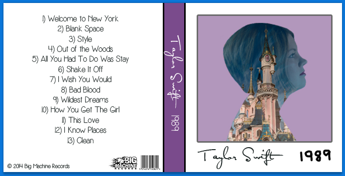
CD/Album: The Final Piece!

CDCoverFinal

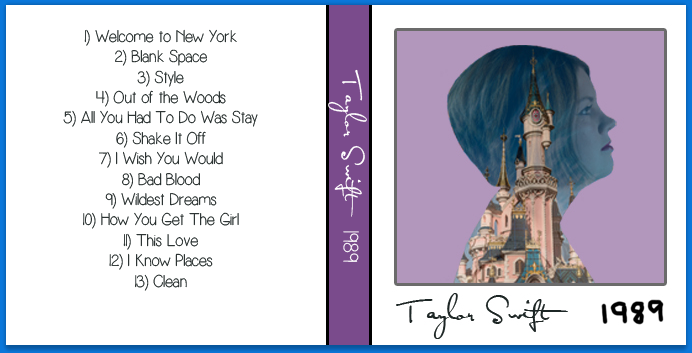
This is my final design put together. I’m really happy with the final result. Throughout the project, I’ve had a clear idea of what I wanted to create and what I wanted to overall see once I had finished. I’m happy that I kept with the polaroid layout for the front cover, it resembles the actual album almost exactly but I’ve been able to put my own twist onto it. It looks plain but simple, I didn’t want to overcrowd it. I’ve chosen what I think are the most important elements that I believed should be used on there. Overall, I’ve learnt more patience when it comes to editing green screen, I’d be more confident using it in future. I would love to do a project with actual polaroid image at some point, this has definitely inspired me to do that, maybe for my Negotiated Studies projects next year.
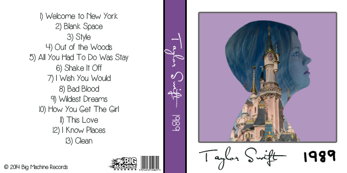
 

CD/Album: Finishing the Final Cover

Screen Shot 2015-05-05 at 14.14.16

Screen Shot 2015-05-05 at 14.14.41

Screen Shot 2015-05-05 at 14.14.58

Screen Shot 2015-05-05 at 14.15.33

Screen Shot 2015-05-05 at 14.15.52

Screen Shot 2015-05-05 at 14.16.07

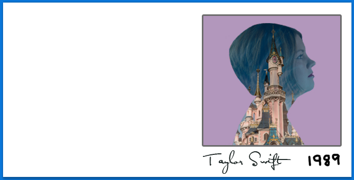
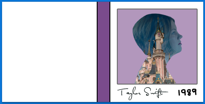
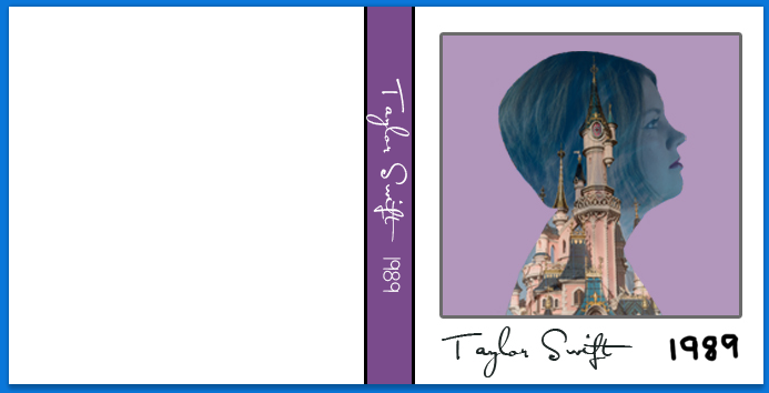
This shows the stages I took to get to my final cover design. It was quite easy to put together since I had already done the front cover and only needed to drag it into this document. The dimensions I used were 680 x 340 with a resolution of 300. The colour of the spine was taken from the original cover also, I wanted the same colour scheme throughout my design. With this, I used the downloaded font for the artist name again to keep it the same as the cover, and used the font from the back cover to do the album title. I found a track list on iTunes, and found the Big Machine Records logo on a Google Image search.


CD/Album: Putting Together the Front Cover

When I had everything I needed, it was time for me to put my cover together. I started with the front, piecing each little bit together, ready for me to just place straight onto the actual cover.

1) Dimensions: 300 x 300. This was the size of the front cover, I had already set up a template in CS5 ready to put this into when it was completed.

Screen Shot 2015-05-05 at 13.47.10 1

2) I wanted to stick with the polaroid element from the original 1989 cover. I used the Eyedropper tool to get a purple from the original, then drew a square leaving enough room at the bottom to include the artist name and album title. I changed the opacity of the square because I felt that it was originally too dark and may overpower the montage image.

Screen Shot 2015-05-05 at 13.47.28

3) I added the image I had previously created into the purple square to create the desired polaroid effect.

Screen Shot 2015-05-05 at 13.47.45

4) To finish it off, I downloaded the iconic font used on previous Taylor Swift covers, I found this on a website called fontmeme.com. I placed this in the white space underneath the image and then wrote the 1989 myself using the Brush tool.

Screen Shot 2015-05-05 at 13.48.01

CD/Album: Cue the Montage!

JenGreenScreen

I decided to create everything separately and then put each element into the final cover. The first step was to create the photo manipulation for the front cover. I had already picked the most suitable image for this and needed to cut out the green background. I used a mixture of the Magic Wand tool to get rid of the initial green, and then the Brush tool to go around the edge of what was left, just to get rid of any noticeable green.

CDCutAround

This is what the finished result looked like. I think I did pretty well with going around the face, I always seem to struggle when doing work like this. Next, I needed to choose an image to place onto it to create the montage effect. This would just be a random image out of my collection.

Disneyland 2015 Watermark-3

I decided to use this because of the mixture of colours. It also looks really sharp and shows every little detail of the castle, and I think the pink will go well with my final CD cover. The final stage of creating the cover image was putting these two images together. This was fairly simple, all I needed to do was layer this image on top of the model and then cut around her again so that the images would match properly. I had to do a little adjustment to the edge of the hair to get this to look right, but after a little bit of experimentation, I managed to get it right and this is the final image I will be using.

CDImage

CD/Album: Green Screen Images

taylor-swift-style

Because I wanted to recreate this, I thought the best way to take my photographs would be on a green screen. I would only need a few headshots for this, the editing and creating the final album was going to be the challenging part of this. I got four images in total, I figured this would be enough since I would essentially be using just one.

JenGreenScreen JenGreenScreen2 JenGreenScreen3JenGreenScreen4I decided to go with the image where the models face is facing sideways, because its the same pose as the one from the video, and I wanted to keep it as similar to the original as possible. At this point, I wasn’t sure what I was going to use for the overlay image, but it would be easier to decide once I had edited the original model shot.

CD/Album: Music Video Inspiration

This is the music video that inspired me to go with 1989. I love the manipulation used, I think it makes it look so iconic and stand out from the crowd. I want to use this technique to create a new polaroid image for my revamp of the album, so green screening will be the right way for me to take my photos. That way, it makes it simpler for me when editing and placing the final photo into the finished piece. The thumbnail that has inspired me the most is below. I remember watching it for the first time and immediately knowing that this is what I wanted to do.

taylor-swift-style

CD/Album: Chosen Album

Taylor_Swift_-_1989

I have decided to use Taylor’s latest album, 1989. The reason I decided to go with this one is because one of the music videos from this has a really interesting concept used and I would love to recreate it using my own photos. The other main reason is because its in a polaroid format. I’ve worked with polaroid before and it would be great to try and work in that format for my Negotiated Studies project next year. I want to try and keep to the format of this but add my own twist to it.

CD/Album: Artwork Research

I have a choice of five albums I can redesign. They’re all really simply designed, but because I love the music on all of them it will be difficult for me to choose the one I want to actually use. My favourite overall album is Red but the artwork for it has never really appealed to me much, as it hasn’t on any of them really, I’m more interested in the content rather than the presentation of it. I think my overall design should include the iconic signature to make it look more recognisable and keep it true to the artist. I need to have a good think before making my final decision as to which one I should use.

CD/Album: Chosen Artist

Taylor-Swift-1940x720-v2Choosing an artist for this assignment was a no brainer for me. I absolutely love Taylor Swift and I have enjoyed her music since my young teenage years. I have each of her four albums and I’ve seen the change in her music over the years. I’d much prefer to work with an album rather than just a single CD, because that way I can have more creativity and just have complete control over an entire sleeve rather than just the cover. There are five albums I have to choose from, and I have a rough idea of which one I would like to use but I want to look into the artwork a little more before making my final decision.

ARD506 CD/Album Assignment

The Design Directions brief includes a range of assignments. They intend to provide you with conceptual work, in which you develop the idea of your image and capture it with a camera, and reactive work, where you respond to the images presented to you in real time. In some cases, you must communicate your ideas BEFORE you produce the images. In others you most communicate your intentions.

CD/Album

Use a combination of photography and graphics to redesign a CD album cover. Incorporate type into your final design. You should aim to improve the appeal of the cover. Provide the original cover for comparison.